
MFG #06: Error Pages, Advertising Fatigue, Product Reviews, and more
Reducing drop-off rates with error pages, navigating advertising fatigue, and how to get excellent product reviews.


Hi there.
Welcome to the 15 new subscribers that joined Marketing For Geeks since the last issue. Every other week, I share 1 interesting thing from my week, 3 actionable marketing insights that have helped me become a better product marketer, and 5 pieces of marketing that caught my eye.
Let's dive in!
🔑1 Interesting Thing
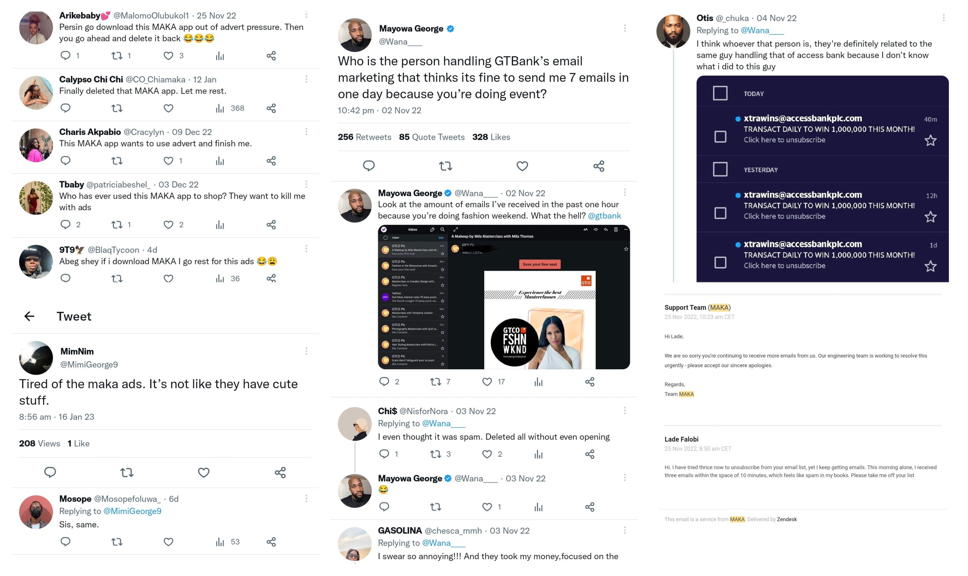
Sometime last year, I downloaded a fashion marketplace app — Maka — after seeing numerous ads about it. I uninstalled the app not long after because I realised the app was not for me.
Between the time I uninstalled the app to this moment, I have been bombarded with advertising messaging from Maka. I had to, at a point, send an email asking to be taken off their email list because the unsubscribe button wasn’t working. Last week, I started thinking about other brands like Maka that had overloaded customers with marketing messages, causing them to lose potential and existing customers.
As it turns out, I wasn’t the only one.
There are two things to note here for me:
Advertising fatigue is definitely a real thing. Ad fatigue happens when people see your ads so often that the ads lose meaning for them and they become bored, disinterested, or annoyed. This is even worse when you’re overwhelmed with the same piece/type of content over and over again (it is possible for ads to have the same core message, but with diversified content).
It’s hard to give a single figure for recommended ad frequency, because there are so many other factors that come into play. To help, you can check industry standards, compare against competitors or similar products, and test different frequencies before pushing messaging at scale.
In the case of some channels (e.g. emails), you can give your users the option to reduce messaging frequency by managing their preferences (sometimes, people don’t want to unsubscribe; they just want to manage what messages they receive and how frequently they receive them). You should also inform users on email frequency before they sign up to your list.
Halfway into writing this, I realised that I saw ads from another brand, OKash, almost as much as I did from Maka, but I did not feel the same annoyance that I felt with the latter (I merely felt disinterest with OKash). I spent some time wondering why that was and then it hit me — I had never used OKash. Part of the reason I felt annoyed by Maka’s messaging was that I wasn’t getting messages that were relevant to my stage in the lifecycle. I was receiving the same ads I had received before I installed Maka.
They did not, for example, attempt to find out the reason why I churned. If they had asked about my reason for churning, they might have found out that I uninstalled the app and unsubscribed from their email list because the outfits I saw at the time didn’t fit my personal style. They could have sent me messages when they did have outfits that fit my style. They could have used retargeting ads that spoke about their “My Preferences” feature where you can tailor the outfits you see by selecting style, creator, and size preferences.
TL;DR (Too Long, Didn’t Read): Advertising fatigue happens to the best of your customers. Reduce ad frequency and diversify your messaging and content format so they do not see the same content over and over again. Even better, tailor your messages to their lifecycle stage — do not send potential users the same messaging you send existing users or churned users. When possible, inform users in advance about email frequency and give them the option to define their messaging preferences.
💭3 Insights
#1. Don’t ask people if they’d use something — ask if they’d pay for it.
Older subscribers are probably tired of hearing me talk about user interviews, but I can’t help it — they’re worth all the hype.
I held discovery interviews for a fintech last month and one of the questions I asked was about their willingness to learn about finances and investing. Everyone I interviewed said they were interested — and that was where suspicion came in. Even interviewees that had shown extreme disinterest in financial products responded in the affirmative.
So in one of the interviews, I tested asking if they would pay to learn instead, and that was where I unearthed an interesting insight for the product — learning wasn’t a strong enough value for the users; it was merely an interesting add-on.
TL;DR (Too Long, Didn’t Read): Asking people whether they would pay for your value prop helps you determine its strength as a stand-alone feature and helps you prioritise features based on importance/value to the user.
#2. Ask for reviews at euphoric touchpoints.
Sometimes users enjoy your product so much that they naturally share reviews online, but this isn’t always the case. In fact, I’d say users are more likely to leave negative reviews when they face a slight blocker than to leave positive reviews when they have good experiences. Many times, people need to be prompted to give good reviews.
A great way to ensure you get positive reviews from your users is by identifying their euphoric touchpoints. At what point in their use of your product are they the happiest? For an Amala joint, this point could be right after your customer has devoured a bowl or after they’ve unbuttoned their jeans to create more space for the food or after they have requested a second helping.
You need to figure out what point in your user’s lifecycle that they feel the most euphoria. This could be after they have just cashed out earnings or gotten an order or gotten great post engagements. The euphoria moment will be different from product to product, but once you find yours, you’ll strike gold with feedback.
TL;DR: There is a point in your user’s lifecycle when they gain the most value from your product and feel at their most satisfied. This is the best moment to ask for reviews from your user.
#3. The right error page can reduce bounce rates
An error message is rarely ever a good thing. It is a literal blocker — a wall telling the user that they cannot take their desired action or that something is broken with the product — which makes it a potential drop-off point.
However, it’s a part of the product that many marketers forget to optimise (myself included). Your error message can be a pivotal moment in the customer’s lifecycle, especially for new users. It can either turn them off from the app completely or give them a reason to try again.
The obvious goal should be to create error pages that urge users to keep using the product despite the blocker they have faced. There’s a lot of ways to do this and I have included 5 real-life examples in the “5 pieces of marketing” section.
Off the top of my head though, here are a few ways to optimise your error page:
Tell the user what’s wrong in language they can understand. No jargon.
Tell the user how they can fix the problem.
Tell them who they can speak to if they want more information
Show them other actions they can take to enjoy the product (this is especially important if the error is unfixable).
Be witty if you can, but don’t make light of important problems (e.g. if a customer cannot make a transaction) or isolate them with unrelatable humour.
If this is a time-bound error, tell them when the problem would be fixed and give them a reminder once it has been fixed.
TL;DR: Error pages are a drop-off point for many users. Provide them with relevant, timely, and useful information so they don’t abandon the product entirely after seeing an error message.
⚡5 Pieces of Marketing
#1. This error message from a Google plug-in👎🏽👎🏽
Language is too technical and doesn’t inform on what to do next

#2. This error page from Medium👍🏽
Uses a few too many metaphors but pushes user to keep using the product + makes an interesting product use case.

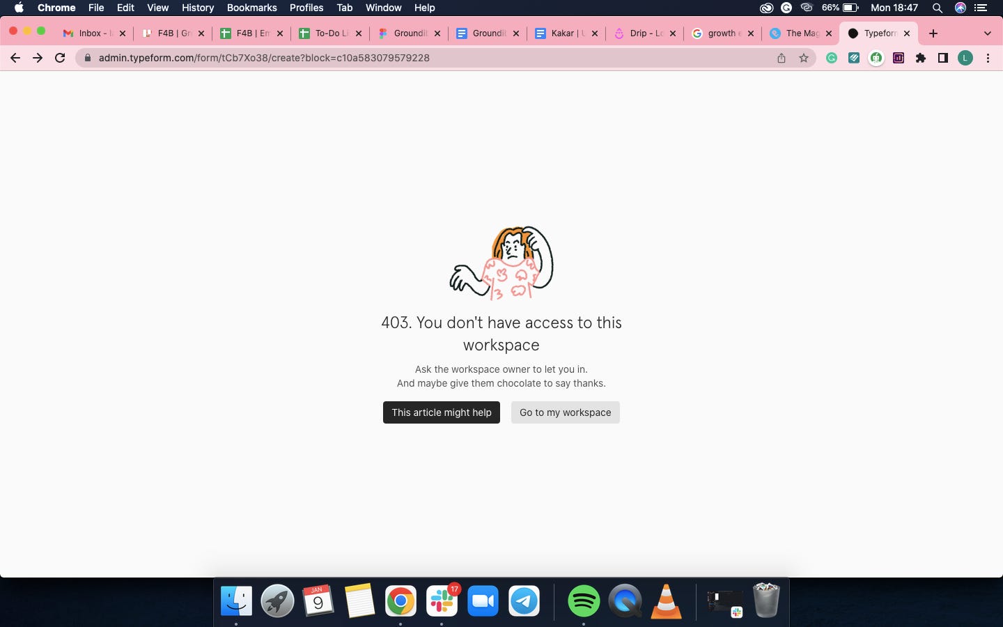
#3. This error page from Typeform👎🏽
Would be more useful to be able to send a message to the workspace owner from this page
#4. This error message from Substack👍🏽
Language could be better, but provides a useful link with information on technical outages at Substack

#5. This notification from Google Chrome👍🏽
Adding this as a bonus because it made me chuckle.

A little about you
I’m on a quest to know more about my subscribers, so every month, I’ll have a random question here to help me know a little about you. Don’t worry, it’s completely anonymous. This month’s question:
What I’m Reading
Marketing data isn't a panacea — Data alone isn’t the answer. Marketers should be detectives (drawing patterns and insight from data), not scientists. Reminds me of one of the earlier issues of Marketing For Geeks where I said data should never be taken at face value.
Five steps to starting your product-led growth motion — An in-depth guide for marketers working on self-service B2B SaaS products.
I also like LinkedIn's error page. It says "It's not you, it's us" 😂That copy calms me all the time.
Maka is in a world of their own, I'm afraid. Even the ads can be overwhelming